REDESIGN FOR DECA PACKAGING.
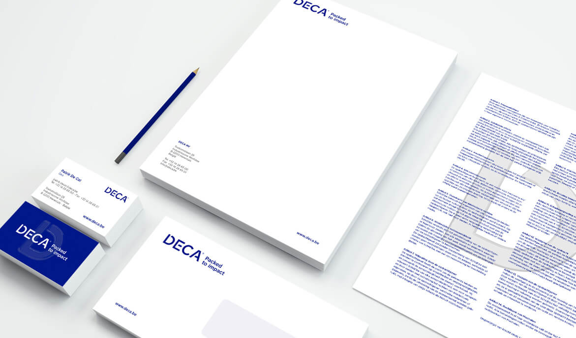
For Deca Packaging the goal was to unite it's three divisions under one flag. With it's more than 30 years experience the firm had outgrown it's branding. We created a monogram "D" as an icon for the company. Open and light. The wordmark grew from there with the same custom touch on every character. And the baseline "Packed to impact" was added to the logotype. To unite the divisions we chose one colour to gather all expertise, from packaging to machinery, under one brand. One family, proudly working with the same goal. Designing, producing, delivering to impact.
For the campaigns we focussed on the fact that Deca is responsable for carrying it's clients product, produced or grown with love, to the end-consumer. It's quality is just as important as that of the product it conceals. This idea is visualized by a transparent "D" that works as an overlay between the product in the background and the viewer. Quality hidden in plain sight.
CLIENT
Deca Packaging
AGENCY
King of Hearts
CATEGORY
Corporate identity & Branding