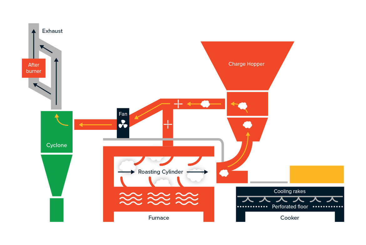
REBRANDING FOR THE MASTERS OF MALT.
Boortmalt, the second largest producer of malt in Europe, came to us to update their branding. Their "Masters of malt" mentality had to be reflected in communication, design and photography. We designed a brand new logo by updating the mark, selecting contemporary typefaces and refreshing the colours. The green element references the Axreal Group and Boortmalts forward way of thinking.
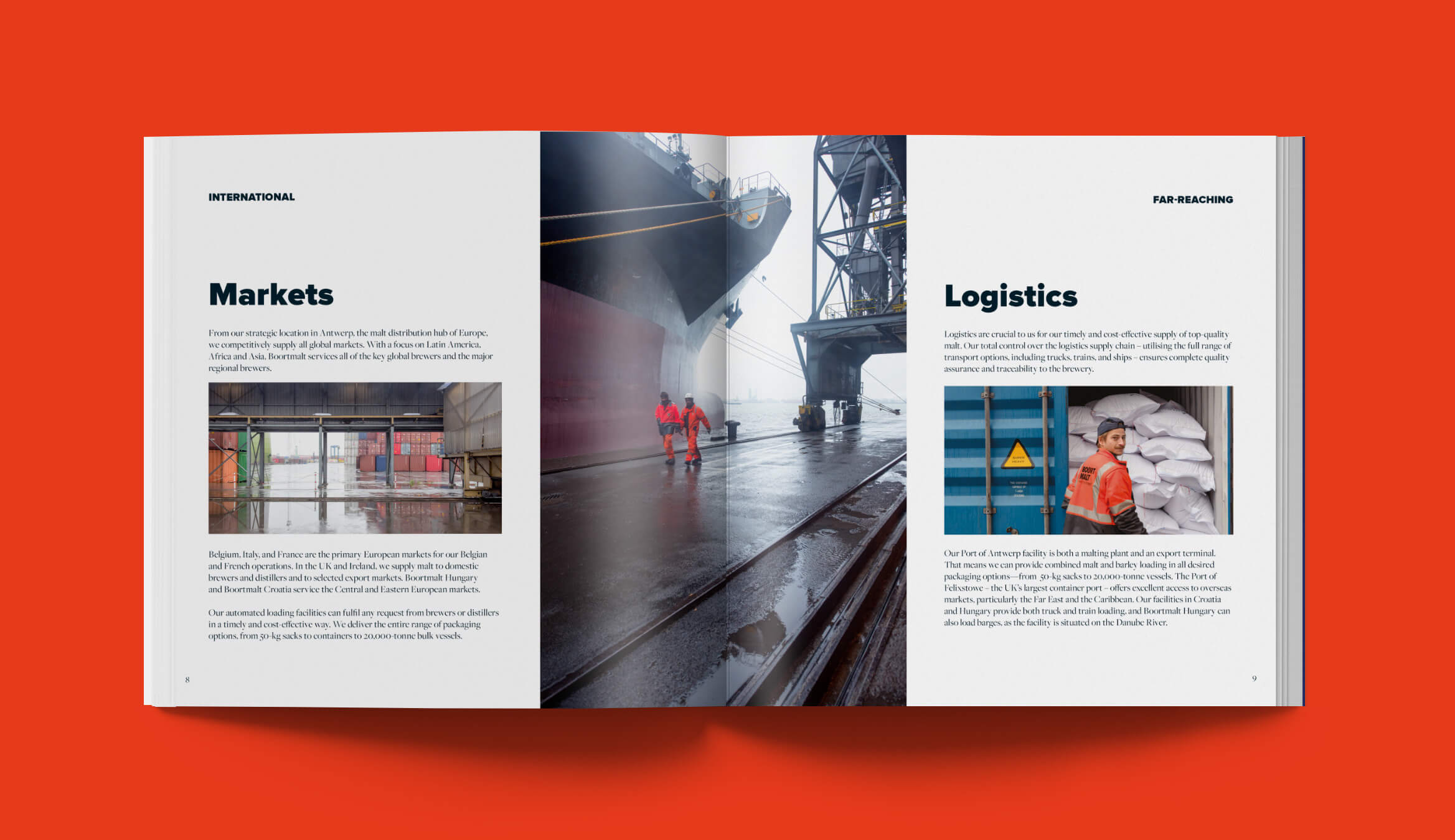
In communication we focused on the employees, because their expertise is key in the malting-process. They make it happen. We shot several portraits on-location capturing the true people and atmosphere of the company. These images, in combination with the use of whitespace and a brand new colour-palette created a clean and fresh branding. Reflecting the culture and vision that Boortmalt stands for. In- & external, on- and offline. From security-vests to bulkbags, from brochures to signage.
CLIENT
Boortmalt
AGENCY
King of Hearts
CATEGORY
Corporate identity & Branding